


Las Vegas Hotel & Vacation Destination
The Resort at Summerlin in Las Vegas is an award-winning resort and casino destination. Experience the total vacation package including the best in gaming excitement, championship golf courses and live entertainment, to luxurious amenities, beautiful hotel rooms, and world-class restaurants.
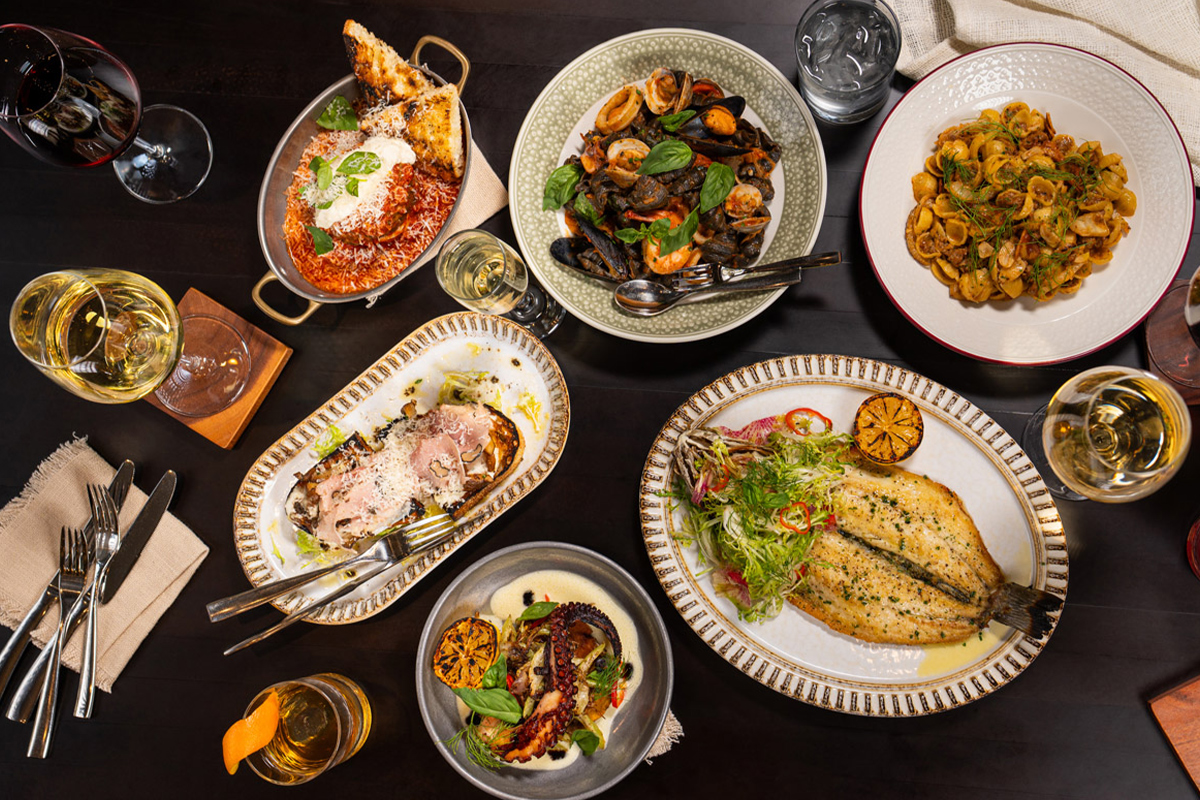
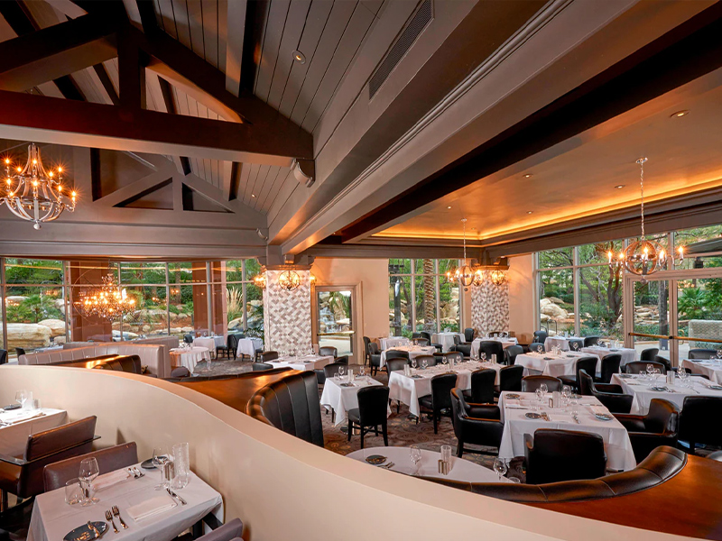
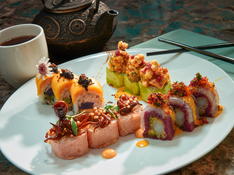
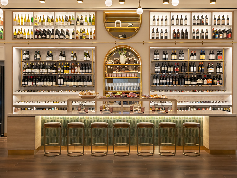
Las Vegas Dining with Comfort and Style at The Resort at Summerlin
The Resort at Summerlin offers a wide range of Las Vegas fine dining restaurants and casual menu options, all delivered with the famous JW Marriott style hospitality. Treat yourself at one of our signature restaurants, or travel around the globe one plate at a time at the Market Place Buffet.


Rampart Rewards, A Better way to Play
Earn rewards points dining at the resort, purchasing beverages at our bars, enjoying a spa treatment, playing your favorite slots and video poker, betting on race and sports, and playing bingo.
Build your tier status credits on every dollar spent on gaming, restaurants, and bars. Increase your card status to unlock exclusive resort benefits and offers.
NEW MEMBERS: Earn up to $1,000 in FREE SLOT PLAY when you join!


A spectacular JW Marriott Las Vegas Hotel & Resort worth betting on
The very definition of Las Vegas luxury, JW Marriott Las Vegas Resort & Spa in Summerlin is one of the city’s most extraordinary hotels in Las Vegas. Situated among Southern Nevada’s most prestigious golf courses, our resort boasts 54 acres of lush gardens and a resort-style pool complete with flowing waterfalls and bubbling whirlpools, close to shopping in Downtown Summerlin and Tivoli Village.


Relax, Restore & Renew at Spa Aquae
Your path to wellness begins with Spa Aquae at our Las Vegas resort off the Strip. Whether enjoying our luxury treatments for an hour or indulging in a full day of spa services, you’ll feel a sense of renewal when you depart.
Follow Us on Instagram
The winner could be YOU! 👀
The Resort At Summerlin – Las Vegas Locals’ Favorite!
🎰 Hot slots, classic table games, race & sportsbook
🍔 Great eats & cool drinks
👉Stay with us at @jwmarriottlv
📍 221 N Rampart Blvd

Don’t worry…we will take care of you ✨👀
The Resort At Summerlin – Las Vegas Locals’ Favorite!
🎰 Hot slots, classic table games, race & sportsbook
🍔 Great eats & cool drinks
👉Stay with us at @jwmarriottlv
📍 221 N Rampart Blvd
We have a winner! ✨ Congratulations to this lucky Vegas local!
All you can eat seafood in Summerlin 🦀
Fridays, 3pm - 8pm
Adults: $55.99 | Kids 10 & Under: $26.99
We are hosting a block party! April 18th give back to @threesquarelv and enjoy food, performances, and community!
Anyone who registers for the event by making a donation to the Three Square Food Bank will receive a Food Hall Passport, which can be redeemed for a tasting portion from each participating restaurant!
🎟️Register for a Passport at the Link in Bio

